Zoe Yu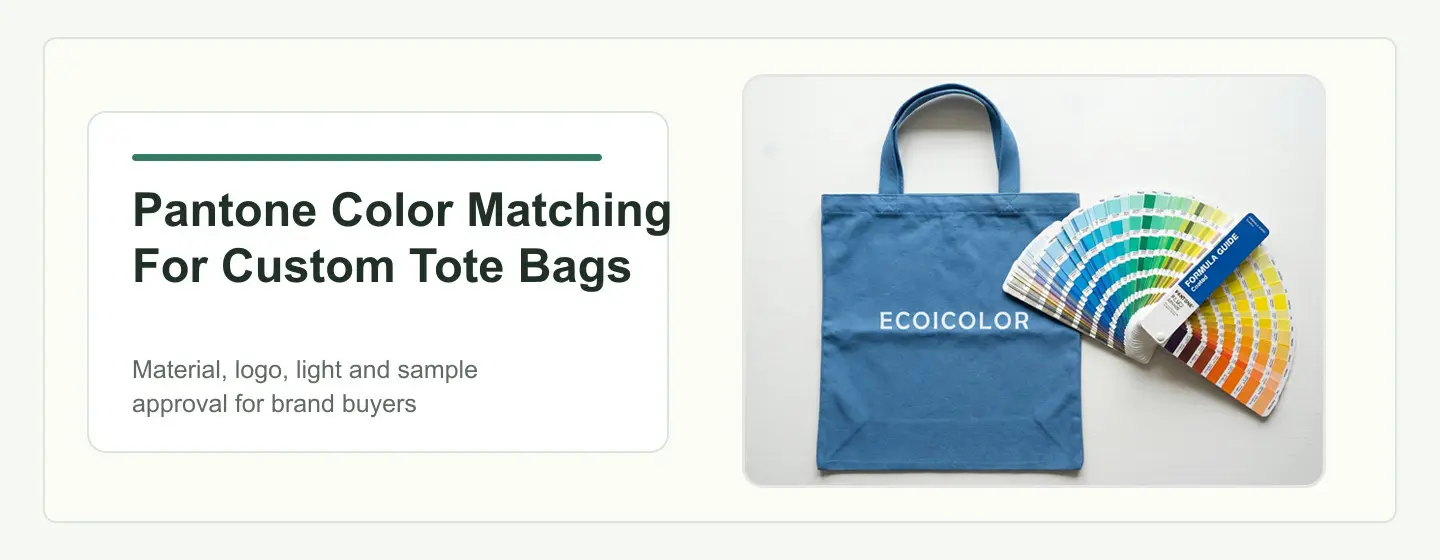
Pantone color matching for custom tote bags is not only about choosing a color code. From the factory side, the final result depends on material surface, logo method, physical samples, light conditions and pre-production approval before bulk production.
This matters especially for beauty, wellness, DTC, retail, hotel and brand campaign buyers. A tote bag may sit next to skincare bottles, paper packaging, hangtags and retail labels. If the color feels wrong, the whole campaign can look less controlled.
Ecoicolortote works with qualified brand buyers from 500 pcs per style. For color-sensitive programs, we recommend confirming the color route before sampling, especially when the project includes custom fabric color, Pantone logo printing, embroidery thread, woven labels, paper packaging or repeat seasonal campaigns.
Buyer Summary
- Best for: beauty, wellness, DTC, retail, hotel, event and campaign buyers sourcing custom tote bags from 500 pcs per style.
- Main decision: Pantone is a useful shared color language, but the approved physical sample should become the real production color standard.
- Factory-side note: the same Pantone can look different on cotton canvas, recycled cotton, rPET, vegan leather, embroidery thread, paper cards and metal plates.
- What to prepare: Pantone references, vector logo files, material direction, quantity, logo method, packaging color needs, launch date and sample approval deadline.
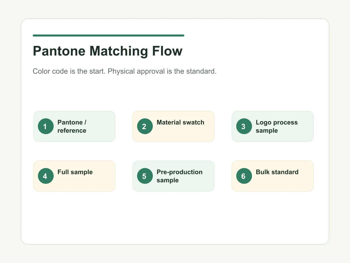
- Approval point: color should be confirmed by material swatch, logo process sample, complete sample and pre-production approval before bulk production.
What is the quick answer for Pantone color matching on custom tote bags?
Pantone matching gives the buyer and factory a shared color reference, but tote bag color still depends on material, logo process, lighting, batch variation and physical approval. The approved sample should become the final production color standard.
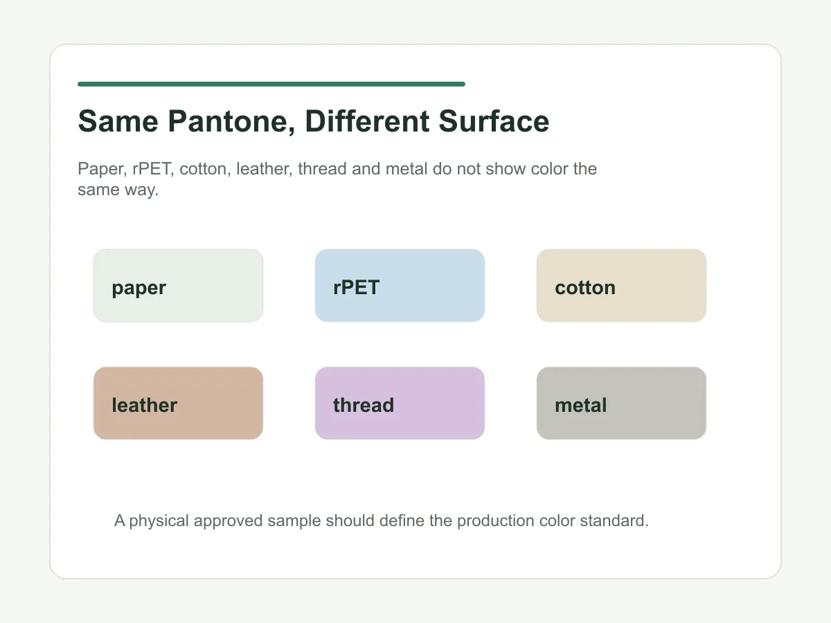
A Pantone number is a starting point, not a guarantee that every surface will look identical. Color printed on paper, dyed into cotton, printed on rPET, stitched with thread or plated on metal can shift visually. The practical goal is controlled color, not unrealistic sameness across every material.
What does Pantone matching mean for custom tote bags?
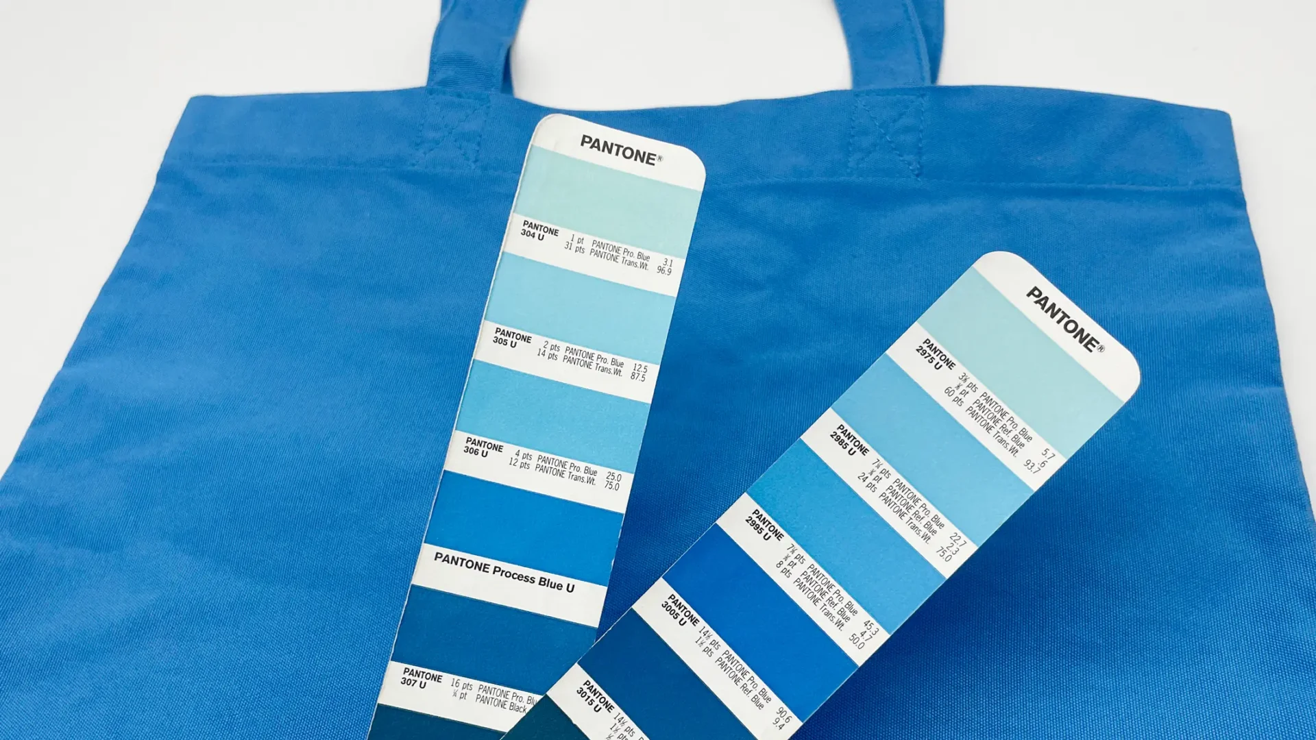
Pantone matching means using a recognized color reference to guide material, logo and packaging decisions. For custom tote bags, the Pantone reference should be checked against the actual fabric, logo process and production sample.
Pantone Connect Premium1 provides access to Pantone color libraries that can support color communication in graphics and product development. For custom tote bags, a Pantone reference helps us understand the target color for fabric, logo printing, embroidery, labels or packaging.
But Pantone matching is not only a digital conversation. A color on a screen, a paper swatch, a cotton fabric, an embroidery thread and a coated paper card may all carry the same color direction differently. This is why the physical sample remains the practical production reference.
Which tote bag parts may need Pantone color matching?
Brand buyers may need Pantone matching for bag fabric, printed logo, embroidery thread, woven label, leather patch, metal plate effect and packaging paper. Each item should be confirmed in its own material context.
Beauty and wellness buyers often care most about logo color, product packaging color and the way the tote looks with the product set. DTC and retail buyers may also need SKU labels, hangtags, paper cards and barcode packaging to match brand guidelines.
If the project has a multi-color logo, buyers should provide each Pantone reference where possible. If they only provide a JPG, website color or packaging photo, we can use it as a starting reference, but it should be converted into a physical color confirmation before bulk production. For final logo artwork, vector production files are safer than low-resolution images because file handling can affect text, edges and color separation.
Buyers should also remember that color appearance changes across color spaces3 when color moves from a digital reference to a physical surface.
Why does the same Pantone look different on different materials?
The same Pantone can look different on paper, cotton, rPET, vegan leather, thread and metal because each surface absorbs, reflects or carries color differently. This is why physical material approval matters.
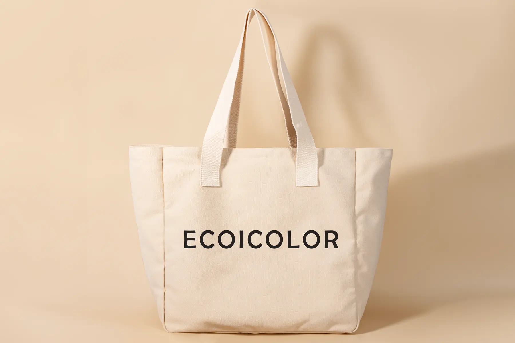
Cotton canvas, recycled cotton and organic cotton have more fiber texture, so color can look warmer, softer or less flat. rPET surfaces may support smoother print effects, especially for multi-color or full-surface artwork. Vegan leather, woven labels and metal plates each need their own sample logic.
For recycled or organic materials, buyers should keep document wording separate from color wording. Global Recycled Standard information2 can help frame recycled material claims, while color approval still depends on physical samples. Environmental wording should also be checked carefully before it is used in packaging or campaign copy. The FTC Green Guides summary4 is a useful reference for avoiding broad or unsupported environmental claims.
How can Pantone shift across tote bag materials?
Pantone color may shift because fabric base color, weave, recycled fiber content, coating, thread sheen and metal finish all affect how the eye sees the final result.
| Material surface | Same Pantone may appear | Main risk | How to confirm |
|---|---|---|---|
| Bleached cotton or canvas | Closer to the target reference | Ink still changes with weave and fabric texture | Print swatch on selected fabric |
| Unbleached cotton / natural canvas | Warmer or slightly muted | Natural base color can shift light brand colors | Approve real fabric color before logo sampling |
| Recycled cotton blend | Softer, warmer or more textured | Fiber variation and batch tone may be visible | Review material swatch and production sample |
| rPET fabric | Cleaner, cooler or more print-friendly | Surface finish affects gloss and saturation | Confirm logo sample on the same rPET surface |
| Vegan leather / coated surface | More affected by coating and finish | Matte, glossy or embossed surfaces change color perception | Approve material and logo process together |
| Embroidery thread | Close thread color, not ink color | Thread sheen and stitch density change the look | Approve thread card or embroidery sample |
| Metal plate / plating | Metal effect rather than Pantone color | Plating finish cannot be judged like printed ink | Approve plating sample or physical metal effect |
When should buyers use stock color versus custom dye?
For small quantity projects, choosing the closest stock material color is often more practical. For larger or repeat programs, custom-dyed material can be discussed when budget, timeline and material availability support it.
If the order is 500 pcs and the brand color must be very specific, the safest first step is to review available material color cards or A/B/C/D swatches. This helps the buyer choose the closest practical color before a complete sample is made.
If the quantity is larger, the program is recurring, or the brand color is critical, custom dyeing may be considered. This usually adds cost and time, so it should be discussed before sampling, not after the full design is approved.
How do logo methods affect Pantone matching?
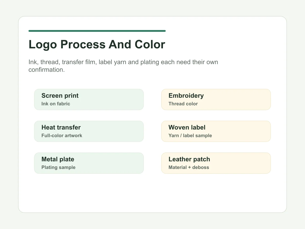
Screen printing, embroidery, heat transfer, UV printing, woven labels, leather patches and metal plates each match color differently. Buyers should confirm the logo method before judging the final color result.
Screen printing is commonly used for Pantone-guided logo colors, but the fabric base still affects the final result. Embroidery usually works from thread color selection, and custom thread color may add time and cost. Heat transfer and digital print are often more suitable for multi-color, gradient or photo-style artwork.
Metal plate color should not be controlled only by Pantone. It should be confirmed by plating sample or approved physical effect. Leather patches and woven labels should also be checked by real samples, not only screen mockups.
What causes color difference between sample, photo and bulk?
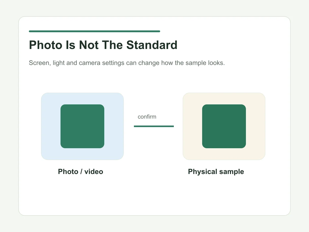
Color difference can come from material absorption, base color, screen display, lighting, camera settings, batch variation, process difference or missing Pantone references. Photos and videos help, but they should not replace physical approval.
Sample photos often look different from the real item. We can use stable lighting, a light box and phone photos or videos to help customers judge the sample more clearly, but the buyer should still approve a physical sample for important brand colors. Pantone also explains that normal production and printing processes can create color variance, so the approved physical sample should remain the practical standard for bulk review.5
Bulk color should be aligned to the approved physical sample within a reasonable production tolerance. For textile products, the approved pre-production sample is the practical standard that the factory and buyer can both check against.
What is the safest Pantone approval process before sampling?
The safest process is color reference, material swatch, logo process sample, complete sample, pre-production sample and bulk standard. The factory should keep an approved sample for production control.
When buyers want brand-color material, we usually suggest confirming the material swatch first. After that, the logo process can be checked. Once the complete sample is approved, the pre-production sample should become the standard for bulk production.
Internally, a signed sample helps the workshop understand what to follow. This is especially important when color, material, logo placement and packaging all need to match the buyer's campaign expectation.
What color matching mistakes should buyers avoid?
Common mistakes include sending only a JPG, not providing Pantone, judging only by screen, confirming only from photos, raising color requirements too late and assuming one Pantone will look identical across all materials.
One important experience from our factory side: many color problems do not happen because the factory ignored Pantone. They happen because the buyer did not confirm what that Pantone looks like on the chosen material and process before bulk production.
If timing is too tight, the buyer may have to choose the closest available stock color instead of waiting for custom dyeing. This can be acceptable, but it should be a planned decision, not a surprise at the end.
Does color matching affect MOQ, sample time or production time?
Yes. Custom material color, custom embroidery thread, woven label color matching and plating samples can add time and cost. Sample timing depends on process complexity, material availability and approval speed.
Ecoicolortote custom tote projects start from 500 pcs per style. Sample timing is confirmed after the material, construction, logo method, artwork, packaging and approval scope are clear; the working schedule also depends on revision speed and current capacity.
Bulk production should be planned after sample approval. The timeline depends on quantity, material availability, color customization, logo process and packaging complexity.
What should buyers send before Pantone color matching?
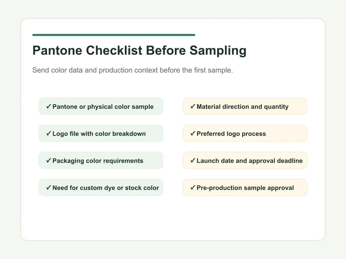
Before sampling, buyers should send Pantone references, logo files, material direction, quantity, packaging color requirements and launch timing. If there is no Pantone, a physical color sample or approved color card helps.
| Color item | What to provide | What can go wrong | How to confirm |
|---|---|---|---|
| Bag body fabric | Pantone, material direction, quantity | Stock color may only be close; custom dye may need more time | Material swatch or A/B/C/D color samples |
| Printed logo | Vector logo file and Pantone colors | Base material affects ink appearance | Logo process sample on selected material |
| Embroidery | Thread color direction and artwork | Thread color may be close rather than identical | Embroidery sample or thread card approval |
| Woven label / patch | Artwork, size, color reference | Small text or yarn color may shift visually | Label or patch sample |
| Metal plate | Artwork, plating direction, finish | Pantone does not directly define plating | Plating sample or approved metal effect |
| Packaging paper | Paper card artwork and color reference | Paper color may differ from fabric or label color | Printed packaging proof |
Pantone Matching Checklist Before Sampling
- Pantone color code or physical approved color sample
- Vector logo file, ideally AI, EPS or PDF
- Material direction such as rPET, cotton canvas, recycled cotton or vegan leather
- Quantity and whether custom dyeing is realistic
- Logo method such as screen print, embroidery, heat transfer or metal plate
- Packaging color needs, if hangtags or paper cards are included
- Launch date and sample approval deadline
- Decision on whether physical sample approval is required before bulk
Who We Do Not Take On
Ecoicolortote is not the right fit for orders below 500 pcs per style without an existing brand project context, buyers who expect exact color matching without physical sample approval, or projects that request custom material color after the timeline is already locked.
We are a stronger fit for brand buyers who can provide Pantone direction, approve material or logo samples realistically, and discuss color, material, packaging and timing before bulk production begins.
FAQ: Pantone Color Matching for Custom Tote Bags
Can Pantone colors match exactly on custom tote bags?
Pantone colors can guide custom tote bag color matching, but the final result depends on material surface, logo method, lighting, sample approval and production batch. Physical sample approval is the safest standard.
What should buyers provide for Pantone color matching before sampling?
Buyers should provide Pantone references, logo files, material direction, quantity, packaging color needs and launch timing. If no Pantone is available, a physical sample or approved color card is helpful.
Does custom color matching affect sample time or production time?
Yes. Custom-dyed material, custom embroidery thread, woven label color matching or plating samples can add cost and time. Timing depends on quantity, material availability and process complexity.
Can one Pantone color look the same on fabric, paper and metal?
No. The same Pantone reference can look different on cotton, rPET, paper, thread, vegan leather and metal because each surface carries color differently.
Is stock fabric color acceptable for brand projects?
Often yes. For 500 pcs or time-sensitive projects, choosing the closest stock material color can be more practical than custom dyeing, as long as the buyer approves the physical swatch or sample.
Should I approve tote color from photos only?
Photos and videos help communication, but they can shift because of lighting, camera settings and screens. For important brand colors, physical sample approval is safer.
Can packaging color be matched with the tote bag color?
Packaging color can be coordinated with the tote, but paper, fabric and label materials may not match exactly. Printed packaging proofs or physical samples should be checked before final approval.
Confirm tote bag color before sampling?
Send your Pantone references, logo files, material direction, quantity, packaging color needs and launch timing. We can help check whether stock color, custom dyeing, logo sampling or packaging proofing is the right route for your project.
Most useful when you include: Pantone code, physical color sample if available, logo process, material direction, target quantity and approval deadline. Send your color matching brief >